Examples
Regenerating the figures
Every figure on this page is produced by a script in examples/ and
committed to docs/assets/. Regenerate them all at once with
uv run python examples/generate_all_figures.py after changing an indicator.
Quickstart: a full indicator bundle
The runnable version of this lives at examples/quickstart.py:
"""Quickstart: compute a full set of indicators on synthetic OHLCV data."""

import numpy as np
import polars as pl

from polars_ta import momentum, others, quant, trend, volatility, volume

# Build a synthetic OHLCV frame (swap in your own data here)
rng = np.random.default_rng(0)
n = 500
close = 100 + np.cumsum(rng.normal(0, 1, n))
df = pl.DataFrame(
    {
        "open": close + rng.normal(0, 0.5, n),
        "high": close + rng.uniform(0.1, 1.5, n),
        "low": close - rng.uniform(0.1, 1.5, n),
        "close": close,
        "volume": rng.uniform(1e4, 1e6, n),
    }
)

# All indicators are Polars expressions — compose them in one with_columns call
out = (
    df.lazy()
    .with_columns(
        momentum.rsi("close").alias("rsi_14"),
        momentum.stoch("high", "low", "close").alias("stoch_k"),
        trend.macd("close").alias("macd"),
        trend.macd_signal("close").alias("macd_signal"),
        trend.adx("high", "low", "close").alias("adx"),
        volatility.average_true_range("high", "low", "close").alias("atr_14"),
        volatility.bollinger_hband("close").alias("bb_high"),
        volatility.bollinger_lband("close").alias("bb_low"),
        volume.on_balance_volume("close", "volume").alias("obv"),
        volume.money_flow_index("high", "low", "close", "volume").alias("mfi"),
        quant.rolling_sharpe_ratio("close").alias("sharpe_63"),
        others.daily_return("close").alias("ret_pct"),
    )
    .collect()
)

print(out.tail(10))
Run it with:
uv run python examples/quickstart.py
Classic indicators on real BTCUSDT data
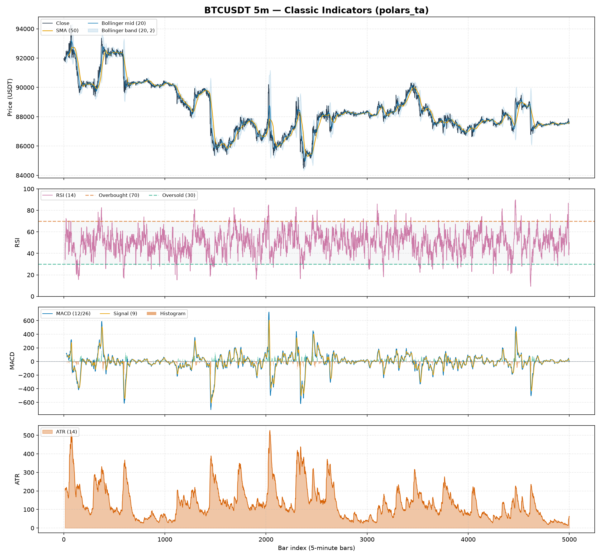
examples/plot_classic_indicators.py plots the well-known retail toolkit — Bollinger Bands, RSI, MACD and ATR — on the same 5,000-bar Binance BTCUSDT 5-minute fixture, so you can see the everyday indicators before the professional-desk ones below.
uv run python examples/plot_classic_indicators.py
Reading the classic panels
Panel 1 — Price, Bollinger Bands (20, 2) and a 50-bar SMA. volatility.bollinger_hband/bollinger_lband draw the ±2σ envelope around the 20-bar moving average; price tagging or piercing a band flags a stretched move relative to recent volatility. The orange trend.sma_indicator is the slower trend reference.
Panel 2 — RSI (14). momentum.rsi with the conventional 30/70 guides. Excursions above 70 (overbought) and below 30 (oversold) are the classic mean-reversion cues.
Panel 3 — MACD (12/26/9). trend.macd, its signal line, and the histogram (macd_diff). Histogram bars are colored by sign and positioned above/below zero, so the momentum cross reads without relying on color.
Panel 4 — ATR (14). volatility.average_true_range, the standard volatility-of-range measure used for stop placement and position sizing.
Trend & volume toolkit on real BTCUSDT data
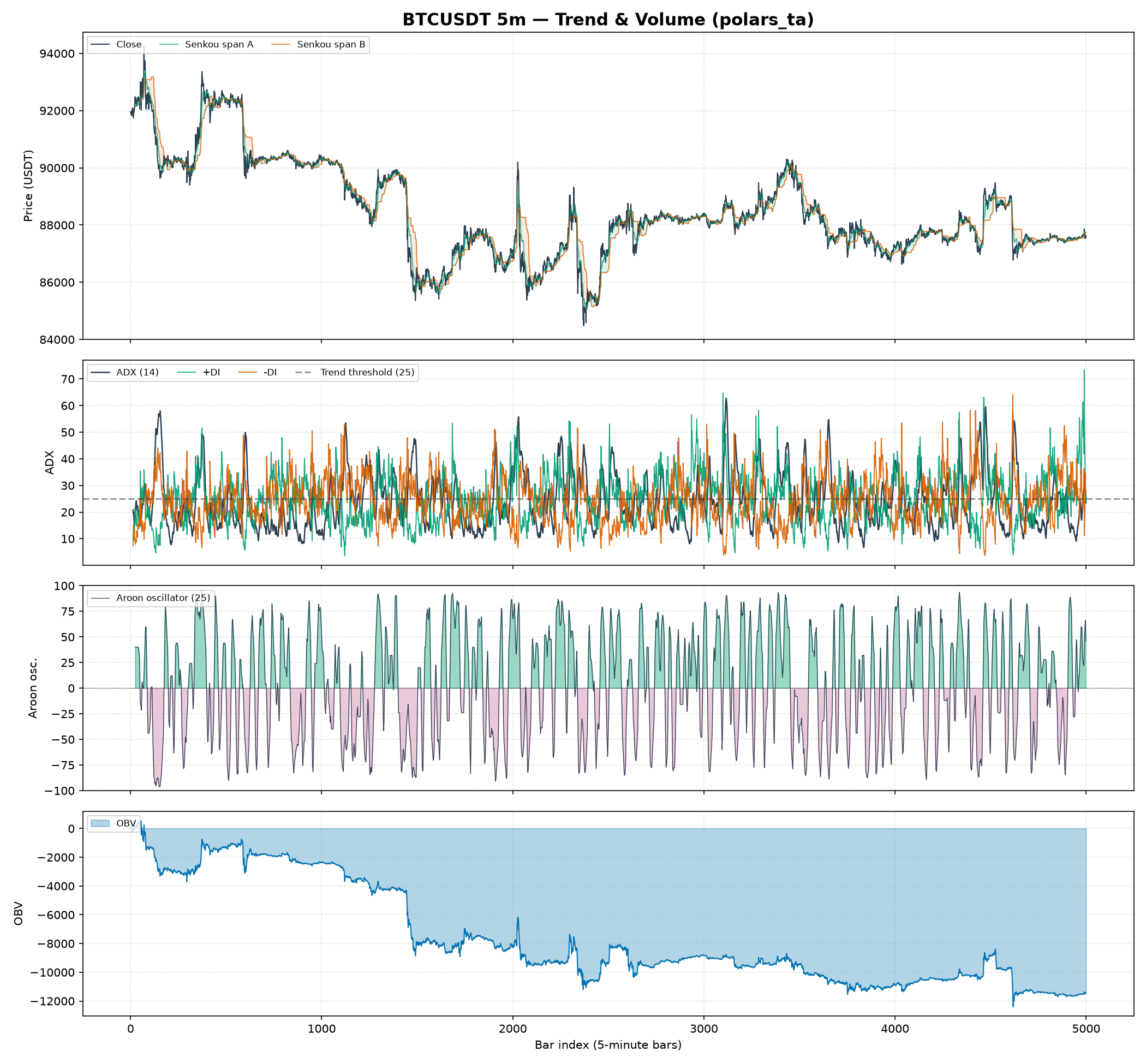
examples/plot_trend_volume.py plots the trend/volume family on the same fixture.
uv run python examples/plot_trend_volume.py
Reading the trend & volume panels
Panel 1 — Price with the Ichimoku cloud. trend.ichimoku_a/ichimoku_b form the "kumo" cloud; price above the cloud is bullish context, below is bearish, and the cloud is shaded green/red by which span leads.
Panel 2 — ADX (14) with directional indicators. trend.adx measures trend strength (values above the dashed 25 line mark a trending market), while adx_pos/adx_neg (+DI / -DI) give its direction.
Panel 3 — Aroon oscillator (25). The difference of aroon_up and aroon_down, shaded by sign — positive (green) when up-trend momentum dominates, negative (purple) when down-trend does. (The raw up/down lines whip too fast to read over 5,000 bars, so the oscillator is shown instead.)
Panel 4 — On-Balance Volume. volume.on_balance_volume accumulates signed volume; its slope confirms or diverges from price moves.
Liquidity & microstructure toolkit on real BTCUSDT data
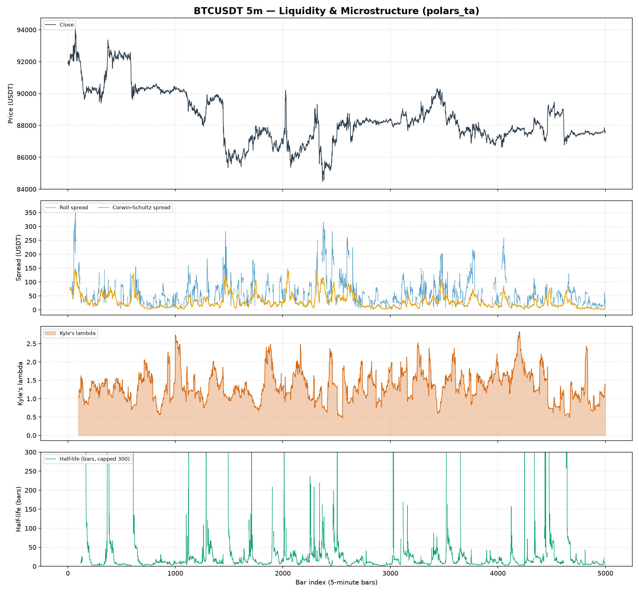
examples/plot_liquidity.py visualizes the professional-desk liquidity features on the same fixture.
uv run python examples/plot_liquidity.py
Reading the liquidity panels
Panel 1 — Price. Reference for the three microstructure panels below.
Panel 2 — Spread estimators. microstructure.roll_spread (from serial covariance of price changes) versus corwin_schultz_spread (from consecutive high-low ranges), both in USDT — Corwin-Schultz is the smoother, more robust estimate on bar data while Roll is noisier and drops out when its covariance premise fails.
Panel 3 — Kyle's lambda. microstructure.kyle_lambda is price impact per unit of signed order flow — higher means thinner, less liquid conditions where a given order moves price more.
Panel 4 — Half-life of mean reversion. microstructure.half_life from a rolling Ornstein-Uhlenbeck fit: single-digit bars mean fast reversion, and the tall spikes are windows where reversion breaks down and the half-life diverges (the axis is capped at 300 bars so the fast-reverting structure stays legible).
Professional-desk regime dashboard on real BTCUSDT data
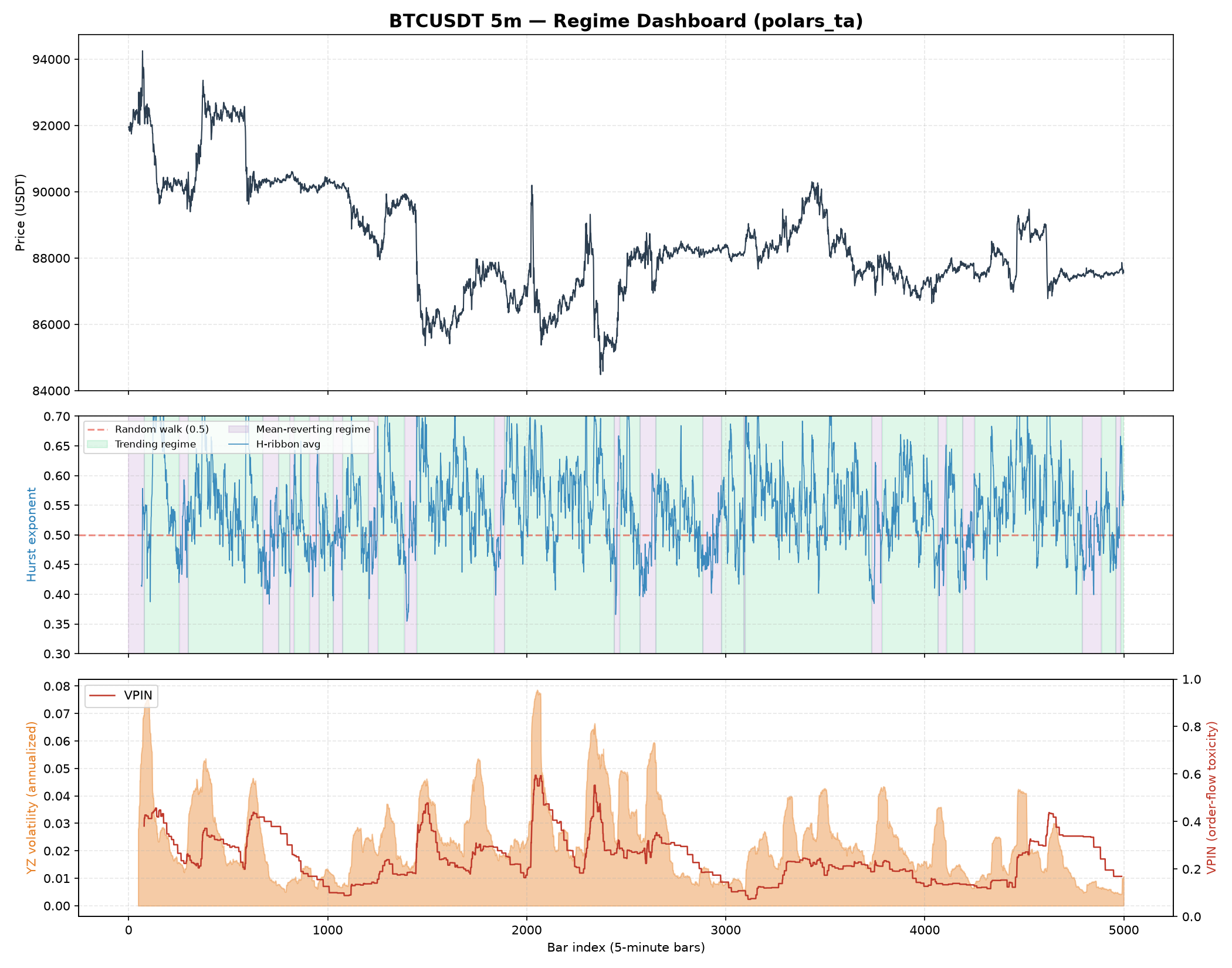
examples/plot_regime_dashboard.py is a runnable matplotlib example that plots polars_ta indicators on real market data — a 5,000-row slice of Binance BTCUSDT 5-minute OHLCV bars (tests/fixtures/btcusdt_5m_sample.arrow), the same fixture used by tests/test_quant.py and tests/test_microstructure.py.
uv run python examples/plot_regime_dashboard.py
Reading the three panels
Panel 1 — Price. The raw BTCUSDT close price over the 5,000-bar window, for visual reference against the two panels below.
Panel 2 — Regime (multi-scale Hurst ribbon). quant.hurst_ribbon("close") computes the Hurst exponent at three window scales (16, 32, 64 bars) and averages them into h_ribbon_avg. The chart shades the background green where the (smoothed) average sits above 0.5 — a trending/persistent regime where momentum strategies have an edge — and purple where it sits below 0.5 — a mean-reverting regime where fading extremes tends to work better. The dashed red line at 0.5 marks the random-walk boundary from the underlying rescaled-range (R/S) theory. Notice how the shading flips back and forth rather than committing to one regime for long stretches — that instability is itself informative: it's a signal that this instrument, at this timeframe, doesn't reward a single fixed strategy family and instead needs regime-adaptive logic (this is exactly why professional desks compute this in real time rather than assuming one regime holds).
Panel 3 — Volatility and order-flow toxicity. The orange fill is quant.yang_zhang_volatility(...), an annualized OHLC volatility estimator that accounts for both overnight gaps and intraday drift (the standard choice on professional vol desks over plain close-to-close historical volatility). The red line is microstructure.vpin(...) — Volume-Synchronized Probability of Informed Trading — computed on 500-unit volume buckets, averaged over a rolling window of 20 buckets. VPIN spikes tend to lead or coincide with the sharpest volatility spikes (e.g. around bar ~2050 in the plot above), which is the whole point of the metric: it is a flow-toxicity early-warning signal, not a directional one — high VPIN says "informed traders are active and liquidity is thin right now," not "price will go up" or "down."
Why this example uses real data, not synthetic noise
Every other example and most unit tests in this repo use synthetic random-walk OHLCV data, which is fine for checking that an indicator's math is internally consistent (e.g. RSI stays in [0, 100]). But microstructure/regime features like VPIN and the Hurst ribbon are specifically about detecting structure that isn't present in i.i.d. random-walk noise — a synthetic series would make the regime panel look meaningless (Hurst hovering uselessly close to 0.5 everywhere, VPIN with no real spikes to speak of). Validating and visualizing them against real BTCUSDT data is what actually demonstrates they work as intended.
New indicators on real BTCUSDT data
examples/plot_new_indicators.py plots the newest indicator batch — both retail-standard trend/momentum additions and microstructure/quant additions — on the same 5,000-bar BTCUSDT fixture used above.
uv run python examples/plot_new_indicators.py
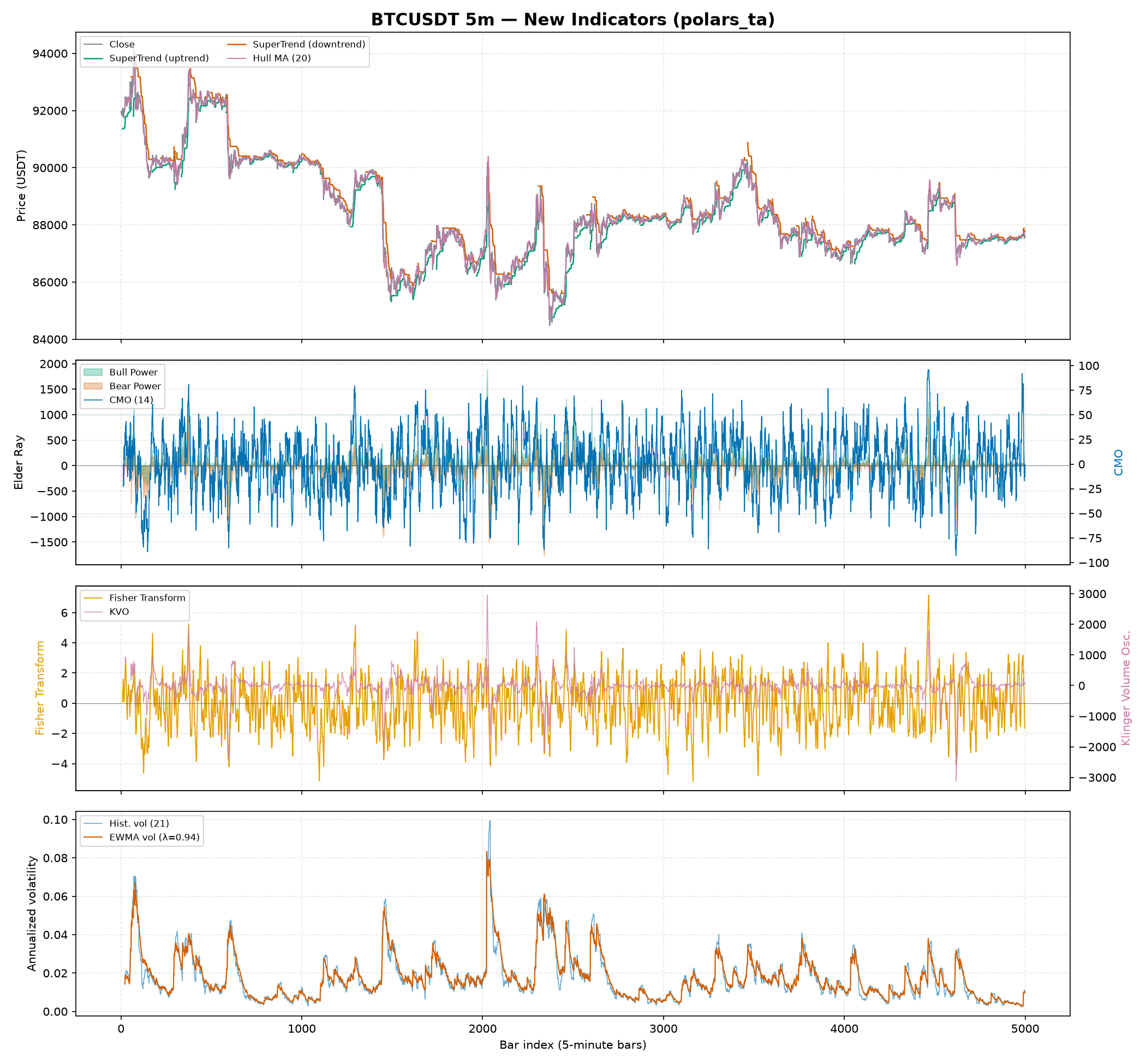
Reading the four panels
Panel 1 — Price with SuperTrend (10, 3.0) and Hull Moving Average (20). trend.supertrend is an ATR-banded stop-and-reverse line — green while price trades above the band (uptrend/long bias), red while below (downtrend/short bias) — computed with the same stateful map_batches band-flip logic as psar. trend.hull_moving_average (purple) tracks price more tightly than a plain SMA/EMA of the same length, trading a little more whipsaw for much less lag.
Panel 2 — Elder Ray (Bull/Bear Power) vs. Chande Momentum Oscillator. trend.elder_bull_power and trend.elder_bear_power measure how far the high/low reach above/below a 13-bar EMA of close — a positive Bull Power with a rising EMA is the classic Elder buy setup. momentum.cmo (blue, right axis) is RSI's less-smoothed cousin: it sums raw up/down moves over the window instead of using Wilder's EMA, so it swings faster and reaches further into the ±100 band.
Panel 3 — Fisher Transform vs. Klinger Volume Oscillator. momentum.fisher_transform (orange) maps a bounded stochastic-style price position through atanh, sharpening turning points into more distinct spikes than a plain oscillator — note it uses Ehlers' original double-EMA-damped recursion, not a one-shot atanh, which is what keeps it from saturating at its clip boundary on noisy real data. volume.klinger_volume_oscillator (purple, right axis) is a volume-force oscillator that flips sign with the typical-price trend direction — used to confirm whether a price move has real volume backing it.
Panel 4 — EWMA volatility vs. historical volatility. quant.historical_volatility (blue) uses a flat rolling window; quant.ewma_volatility (red) uses RiskMetrics-style exponential decay (λ=0.94), so it reacts to a volatility spike immediately and fades out smoothly instead of dropping off a cliff exactly window bars later — visible at every spike in the chart, where the red line leads the blue line up and trails it back down.
Two indicators from this batch don't appear in the figure because they aren't single time-series lines: microstructure.lee_ready_trade_sign classifies each bar as buy/sell/unclassifiable (+1/-1/0) rather than producing a continuous line, and quant.cross_sectional_zscore / quant.cross_sectional_rank rank symbols against each other at each timestamp on a multi-asset frame — see How-to guides for a runnable example of both.
Entropy-based regime indicators on real BTCUSDT data
examples/plot_entropy.py plots the two entropy-based complexity indicators against the multi-scale Hurst ribbon on the same 5,000-bar BTCUSDT fixture.
uv run python examples/plot_entropy.py
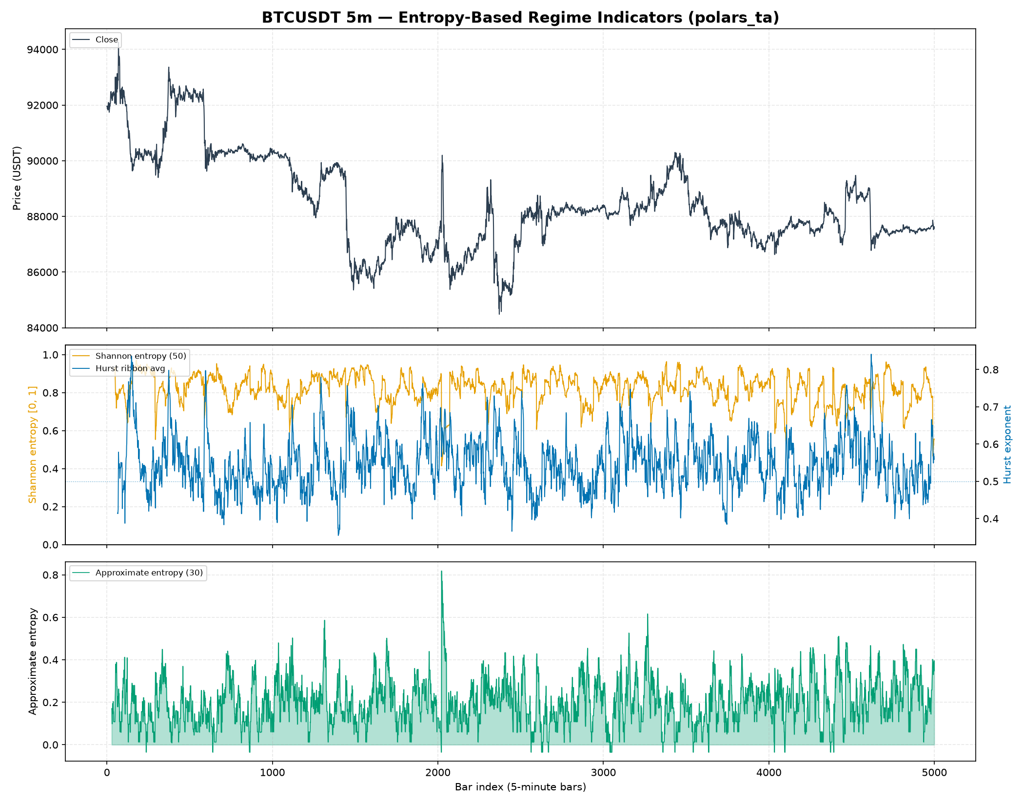
Reading the three panels
Panel 1 — Price. Raw BTCUSDT close, for visual reference against the two panels below.
Panel 2 — Shannon entropy vs. Hurst ribbon. microstructure.shannon_entropy (orange) bins the window's log returns and measures how uniformly they're spread across bins, normalized to [0, 1]. quant.hurst_ribbon's average (blue, right axis) measures directional persistence instead. The two disagree on purpose: Shannon entropy stays consistently high here (returns are well-spread across bins most of the time — this is what noisy real crypto data looks like) while the Hurst ribbon still swings between trending and mean-reverting regimes underneath that noise. A high-entropy, high-Hurst bar means "noisy but trending"; a high-entropy, low-Hurst bar means "noisy and choppy" — two very different trading conditions that either signal alone would blur together.
Panel 3 — Approximate entropy. microstructure.approximate_entropy measures how often short return patterns repeat — low values mean the recent path is more self-similar/predictable, high values mean it isn't. Watch bar ~2050: it spikes sharply, coinciding with the same sharp volatility event visible in the price panel and in the VPIN spike from the regime dashboard above — a sudden break in pattern regularity is itself a marker of a regime change, not just elevated volatility.
A cost note on approximate_entropy. Its rolling window uses the textbook O(window²) pairwise-distance algorithm (no known faster exact form), so it's deliberately run here with a small window=30 — see its docstring for the tradeoff before increasing it on a large frame.
Regime-conditional composite signal on real BTCUSDT data
examples/plot_regime_conditional_signal.py is a capstone example: it wires quant.regime_conditional_signal to the existing Hurst ribbon to switch between a trend-following signal and a mean-reversion signal, on the same 5,000-bar BTCUSDT fixture.
uv run python examples/plot_regime_conditional_signal.py
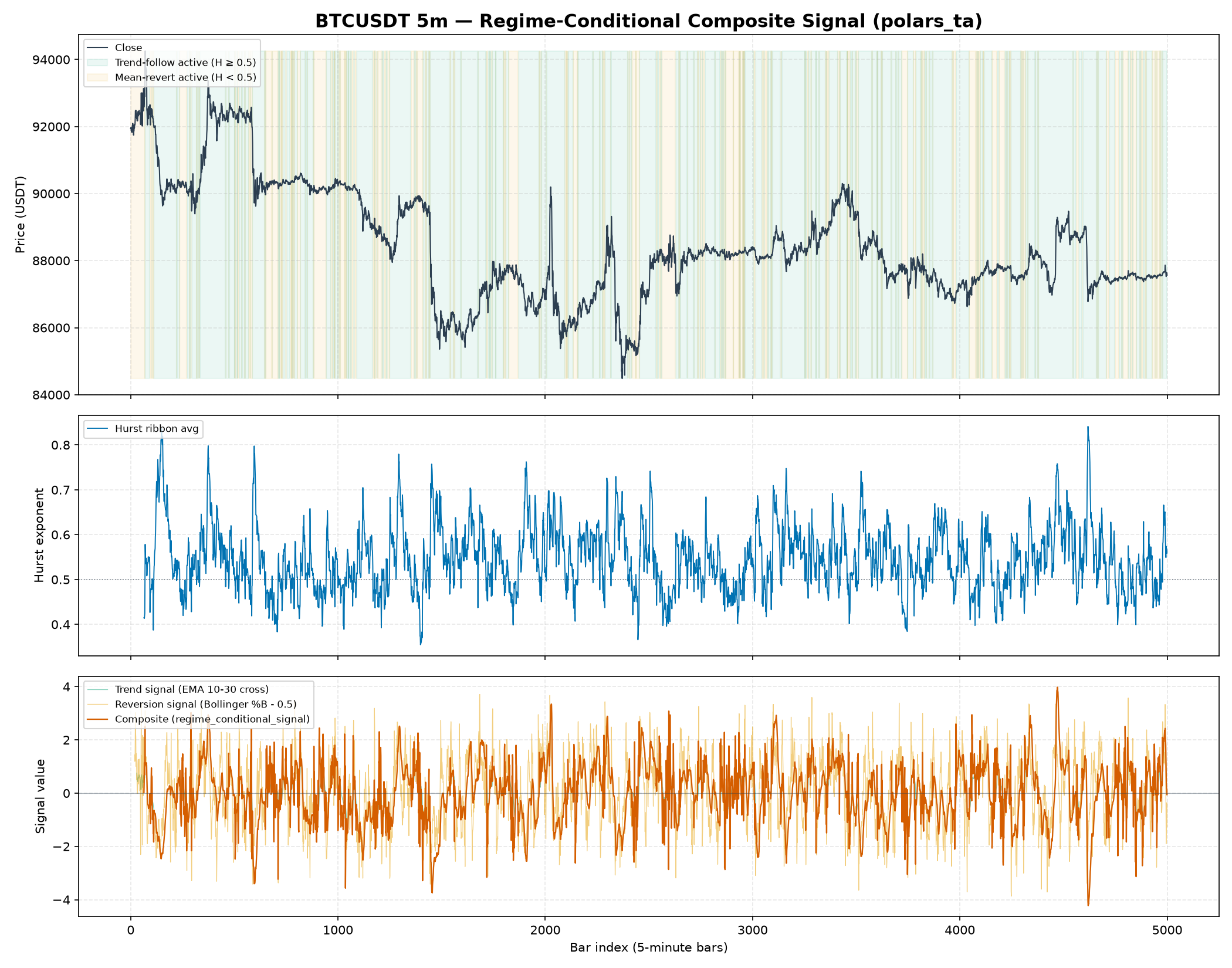
Reading the three panels
Panel 1 — Price, shaded by which branch is active. Green shading marks bars where the Hurst ribbon average is ≥ 0.5 (trend-following signal active); orange marks < 0.5 (mean-reversion signal active). Notice how often the shading flips — this is the same instability observed in the regime dashboard example, and it's exactly the situation this helper is built for: a single fixed strategy would fight itself through these flips, so the composite switches instead.
Panel 2 — Regime score. quant.hurst_ribbon's h_ribbon_avg, the same regime score used to shade panel 1.
Panel 3 — The two candidate signals and the composite. The trend signal (green, mostly hidden under the composite) is an EMA(10)-EMA(30) cross, normalized by ATR so it lands on a comparable scale to the reversion signal (tan) — a Bollinger %B deviation from 0.5, scaled by 4. quant.regime_conditional_signal (red) is the hard row-by-row switch between them: it visibly tracks the trend signal during green-shaded regions and the reversion signal during orange-shaded ones, with a discrete jump exactly at each regime flip rather than a smooth blend.
regime_conditional_signal is a compositional building block, not a Hurst-specific helper — swap in any regime score (ADX, Shannon entropy, a volatility z-score) and any two pre-computed signal expressions. See the "Regime-conditional trend/mean-reversion switch" how-to guide for the minimal version of this pattern.
Case study: which of my 16 indicators are actually different?
Every other example on this page adds a feature. This one asks the question that follows, and it is the only example whose conclusion is to delete most of what was computed.
examples/plot_feature_selection.py
runs the full selection pipeline on 16 indicators spanning
momentum, trend, volatility and volume — the same 5,000-bar BTCUSDT 5-minute
fixture as everything above.
uv run python examples/plot_feature_selection.py
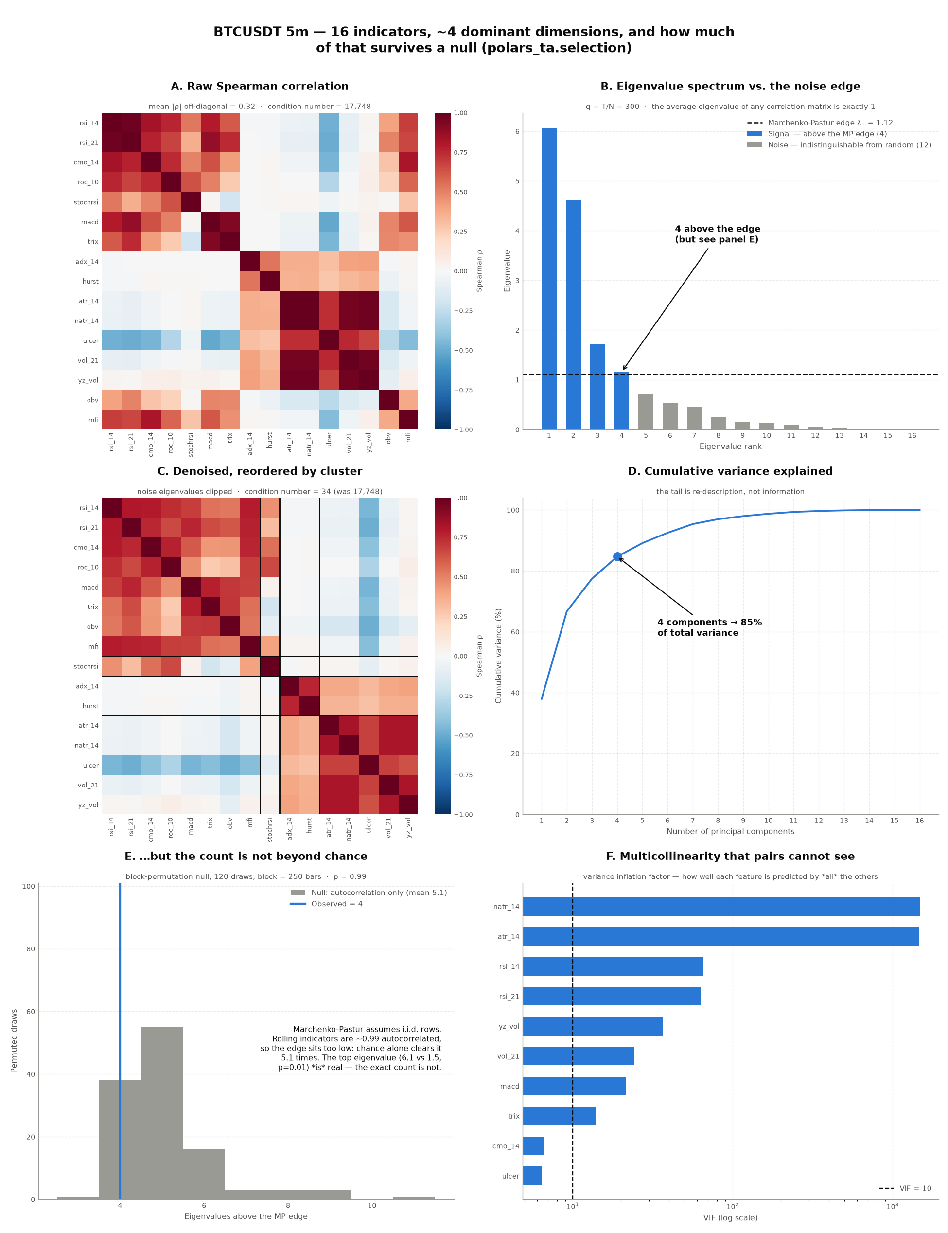
The problem
Sixteen indicators, computed in one with_columns, look like sixteen inputs to
a model. They are not. Measured on 4,801 usable bars:
| Diagnostic | Value | What it means |
|---|---|---|
| Mean |ρ| off-diagonal | 0.32 | the average pair is substantially correlated |
| Smallest eigenvalue | 0.0003 | one direction is essentially flat — the matrix is near-singular |
| Condition number | 17,748 | anything that inverts this matrix is numerically meaningless |
Panel A shows it directly: dense red blocks where whole families move together. That near-singular direction is not a curiosity. A condition number of ~18,000 means a linear model, a mean-variance optimizer, or any GLS step operating on these features is amplifying floating-point noise by four orders of magnitude.
And the damage is not only numerical. Collinearity destroys feature-importance scores: two near-identical features split the credit and both look unimportant, while a mediocre but unique third feature outranks them. This is the substitution effect, and it breaks MDI and MDA alike. Ranking features before removing redundancy answers the wrong question.
The methodology
Four stages, none of which touches a target variable — so none of them can leak a label:
- Stationarity screen. Correlations between integrated series are spurious
(Granger & Newbold, 1974).
nonstationary_featuresflags them by lag-1 autocorrelation. - Spearman correlation. Rank-based, because bounded oscillators and heavy-tailed volatility features break Pearson's linearity assumption.
- Marchenko-Pastur denoising. For \(T\) observations of \(N\) independent variables, noise eigenvalues fall below \(\lambda_+ = \sigma^2(1+\sqrt{1/q})^2\) with \(q = T/N\). Everything under that edge is clipped to the bulk average, which preserves the trace and lifts the near-singular directions away from zero.
- Cluster and elect. Hierarchical clustering on the Mantegna distance \(d_{ij}=\sqrt{(1-\rho_{ij})/2}\), cut at the dimensionality that stage 3 measured, then one representative per cluster — the medoid, which is chosen without reference to any target.
The code
from polars_ta import quant, selection

# Stage 0 — screen before correlating anything.
selection.nonstationary_features(feats, FEATURES, threshold=0.999)
# ['obv']

feats = feats.with_columns(obv=quant.rolling_z_score("obv", 200))
selection.nonstationary_features(feats, FEATURES, threshold=0.999)
# []

# Stages 1-2 — how many dimensions are actually here?
screened = selection.screen(feats, FEATURES)
corr = selection.corr_matrix(screened.values)
rank = selection.signal_rank(corr, screened.q)   # 4

# Stages 3-4 — cut at that dimensionality and elect a representative each.
result = selection.select_features(feats, FEATURES, k=rank)
print(result.selected)
# ['rsi_21', 'stochrsi', 'adx_14', 'vol_21']
What we observe
Only 4 of 16 eigenvalues clear the noise edge. With \(q = T/N = 300\) the edge sits at \(\lambda_+ = 1.12\) — and the average eigenvalue of any correlation matrix is exactly 1, so the bar is low and twelve features still fail to clear it (panel B). Those four components carry 85% of the total variance (panel D).
But that count does not survive a null (panel E). This is the most
important result on the page, and it cuts against the headline. Marchenko-Pastur
assumes i.i.d. rows; rolling indicators are ~0.99 autocorrelated, so n_obs
grossly overstates the effective sample size and the edge sits too low. Test
it with a block_permute null that keeps each feature's own
autocorrelation and destroys only the cross-feature alignment:
| Statistic | Observed | Null (mean ± sd) | p |
|---|---|---|---|
| Eigenvalues above the edge | 4 | 5.1 ± 1.2 | 0.99 — not significant |
| Top eigenvalue | 6.07 | 1.54 ± 0.08 | 0.008 — highly significant |
| Effective rank | 5.66 | 15.5 | 0.008 — highly significant |
Read that carefully. The existence of strong shared structure is beyond any
doubt: the top eigenvalue is 4× what chance produces, and the effective rank is
a third of it. What is not established is the precise number 4 — chance
alone clears the edge 5.1 times on average. So "4 dimensions" is a reasonable
working figure, not a measurement, and effective_rank (5.66) is the more
honest headline. Anyone quoting signal_rank on autocorrelated features without
this test is over-claiming.
VIF finds collinearity that pairwise correlation understates (panel F).
atr_14 and natr_14 score ~1,470 — NATR is ATR divided by price, so each is
almost perfectly predictable from the rest of the set. A pairwise screen at a
0.95 threshold would not necessarily catch it; a feature can correlate modestly
with every other feature individually and still be an exact linear combination
of several.
Denoising fixes the conditioning. Clipping the noise bulk takes the condition number from 17,748 to 34, and the smallest eigenvalue from 0.0003 to 0.18 (panel C).
The clusters are interpretable — which is the real check that this is finding structure rather than fitting noise:
| Cluster | Members | Kept | Reads as |
|---|---|---|---|
| 0 | rsi_14, rsi_21, cmo_14, roc_10, macd, trix, obv, mfi |
rsi_21 |
directional momentum |
| 1 | stochrsi |
stochrsi |
a fast oscillator, genuinely its own thing |
| 2 | adx_14, hurst |
adx_14 |
trend persistence, independent of direction |
| 3 | atr_14, natr_14, ulcer, vol_21, yz_vol |
vol_21 |
volatility / dispersion |
Eight momentum indicators contributed one feature between them. Five volatility estimators — including three that differ only in which parts of the OHLC bar they read — contributed one. Meanwhile ADX lands with the Hurst exponent rather than with the other trend indicators, which is correct and not obvious: both measure how persistent a move is, not which way it points.
Which of those drops are actually safe?
selected says what survived. result.report() says which drops you can
trust — a representative stands in for a member only as well as it correlates
with it. At k=4:
| feature | representative | similarity | decision |
|---|---|---|---|
rsi_14 |
rsi_21 |
0.80 | drop |
mfi |
rsi_21 |
0.77 | drop |
cmo_14 |
rsi_21 |
0.75 | drop |
roc_10 |
rsi_21 |
0.66 | review |
trix |
rsi_21 |
0.65 | review |
obv |
rsi_21 |
0.62 | review |
ulcer |
vol_21 |
0.69 | review |
Dropping rsi_14 at 0.80 costs nothing. Dropping obv at 0.62 throws away
real information — rsi_21 cannot reconstruct it. Those two cases are
indistinguishable in selected alone.
The rule: raise k until nothing says review. Here that is k=6, which
independently agrees with effective_rank (5.66) — while signal_rank's 4 was
too aggressive by three features.
k |
flagged review |
|---|---|
| 4 | 4 |
| 6 | 0 ← smallest safe cut |
| 8 | 0 |
What we conclude
- The feature count was never the constraint. Going from 16 indicators to 205 would not have produced 205 dimensions; it would have produced a longer tail below the same noise edge. Adding indicators from the same family adds estimation noise, not information.
- Always test the dimensionality against a null.
signal_rankreads like a measurement and is not one on autocorrelated data — here the observed count is below what chance produces. Reporteffective_rankand the top eigenvalue, which do survive the null, and treat the count as a ceiling. - Decide with
report(), not withselected. The list of survivors hides the difference between a free drop and a lossy one. Raisekuntil no row is flaggedreview; that is the smallest feature set you can take without losing information. - Run this before any importance ranking, not after. With the redundancy removed, an MDA score on four decorrelated features means something. On the original sixteen it would mostly have measured which member of each family the shuffle happened to hit first.
- The medoid default is the safe one. Electing representatives by
information coefficient looks appealing and is how leakage gets in — an IC
computed over the whole sample encodes that sample's outcome. Use
scores=only with ICs computed on a training window. - This is redundancy analysis, not alpha. Nothing here says the four survivors predict anything. It says the other twelve had nothing to add that these four did not already carry.
The stationarity threshold is resolution-dependent
At 5-minute resolution a 14-period ATR scores ~0.997 lag-1 autocorrelation
without being integrated at all, so the default 0.99 flags eight of the
sixteen. 0.999 cleanly isolates OBV (0.9997), the one feature that really
is a cumulative sum. On daily bars 0.99 is about right. The screen is a
heuristic, not a unit-root test — look at the numbers before trusting the
list.
Case study: how many dimensions does the whole library span?
The study above uses a hand-picked sixteen. This one answers the question
directly — compute every indicator polars_ta exposes and ask how many
dimensions they actually span.
examples/plot_full_library_selection.py
builds the indicators programmatically from the .ta namespace registry, so it
never goes stale: add an indicator to the library and it appears here
automatically. 199 of 205 build from the registry alone; the six exceptions are
listed with their reasons in the script (three need a benchmark asset, one
returns a dict, one needs a non-column argument, and rolling_ic needs a
forward return — look-ahead by construction).
uv run python examples/plot_full_library_selection.py
The answer
| Stage | Count |
|---|---|
| Indicators computed | 205 |
Dense enough (max_missing=0.2) |
204 |
| Non-constant | 183 |
| Eigenvalues above the MP edge | 19 |
| Clusters / features selected | 40 |
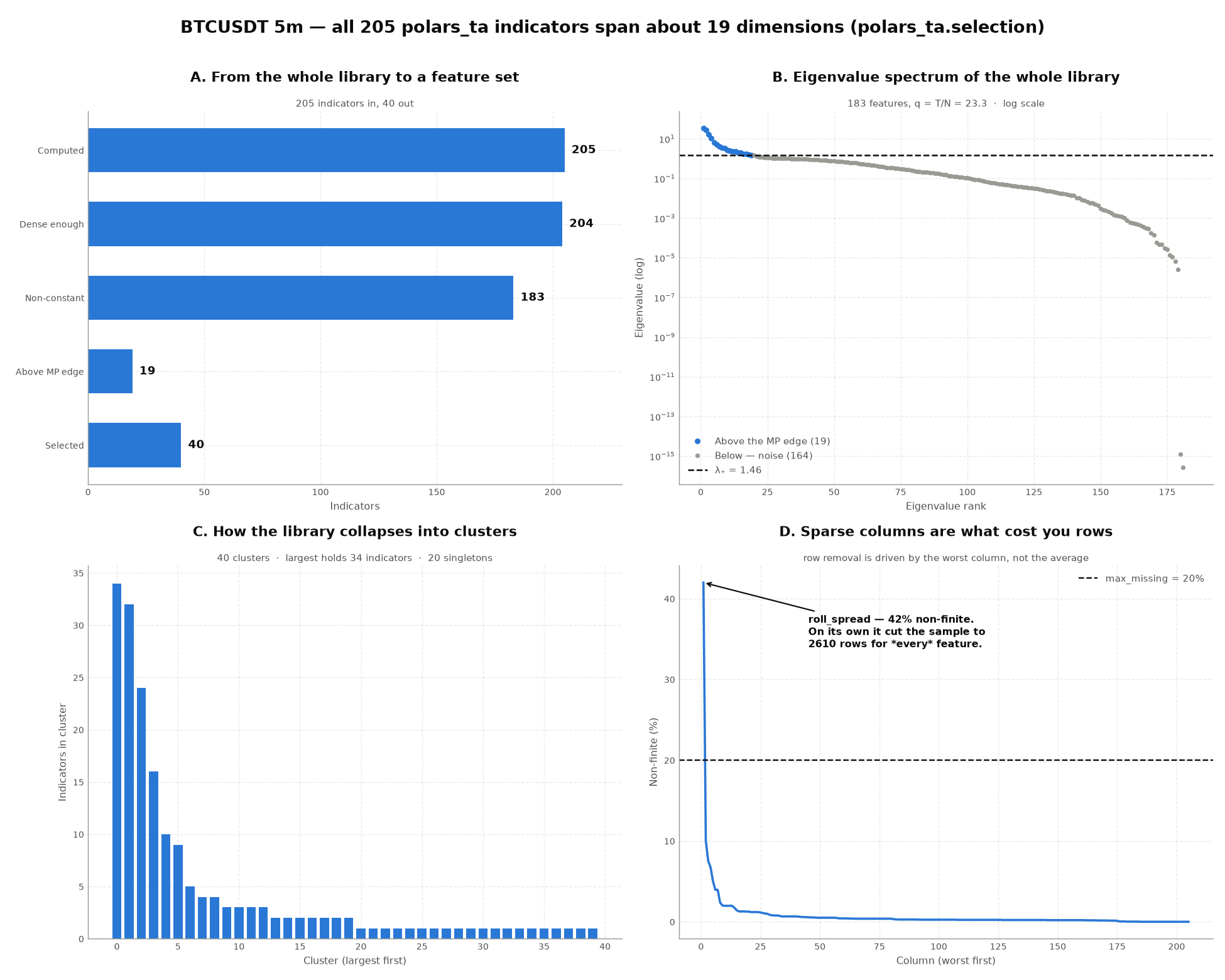
205 indicators, 19 dimensions above the noise edge, effective rank 32. The top 19 components carry 73% of the variance. This is the concrete answer to "how do you manage all of these features": you do not have as many as the column count suggests, and no amount of adding indicators from the same families will change that.
Three things the full sweep exposes that sixteen features did not
One sparse column can cost you half the sample. roll_spread is null
wherever its serial-covariance premise fails — 42% of bars, scattered
throughout, entirely by design. Because screen drops any row with a
non-finite anywhere, that single column took the sample from 5,000 rows to
2,610 for all 184 features. max_missing=0.2 drops the column instead and
recovers 4,272 rows (panel D). ScreenResult.worst_missing() is how you find
the culprit.
21 of the 61 candlestick patterns never fire once in 5,000 bars, leaving
all-zero columns. A zero-variance feature has undefined correlation and puts
NaN through the entire eigendecomposition, so screen removes them — but the
deeper point is that correlation is the wrong lens for sparse 0/±100 spikes
in the first place. Use
mutual_information
or cluster on
variation_of_information
when candles are in the matrix.
The condition number reaches 2.2 × 10¹⁸. The full library is singular to machine precision. Any model that inverts this matrix — mean-variance, GLS, OLS normal equations — is returning noise, not an answer.
The clusters are recognisable
The largest cluster holds 34 indicators; 20 clusters are singletons. The big groups are exactly the families you would draw by hand — a price-level group (moving averages, Bollinger bands, cumulative return, A/D line), an oscillator group (CCI, CMO, money-flow, Chaikin), a range/volatility group (ATR, NATR, Donchian width, spread estimators), and a directional group. That the method rediscovers the library's own taxonomy from the data alone is the best available evidence it is finding structure rather than fitting noise.
Does any of it actually predict?
The sweep above stops at redundancy: it says the 205 indicators span about 19
dimensions, but says nothing about whether those dimensions are useful.
examples/plot_feature_importance.py
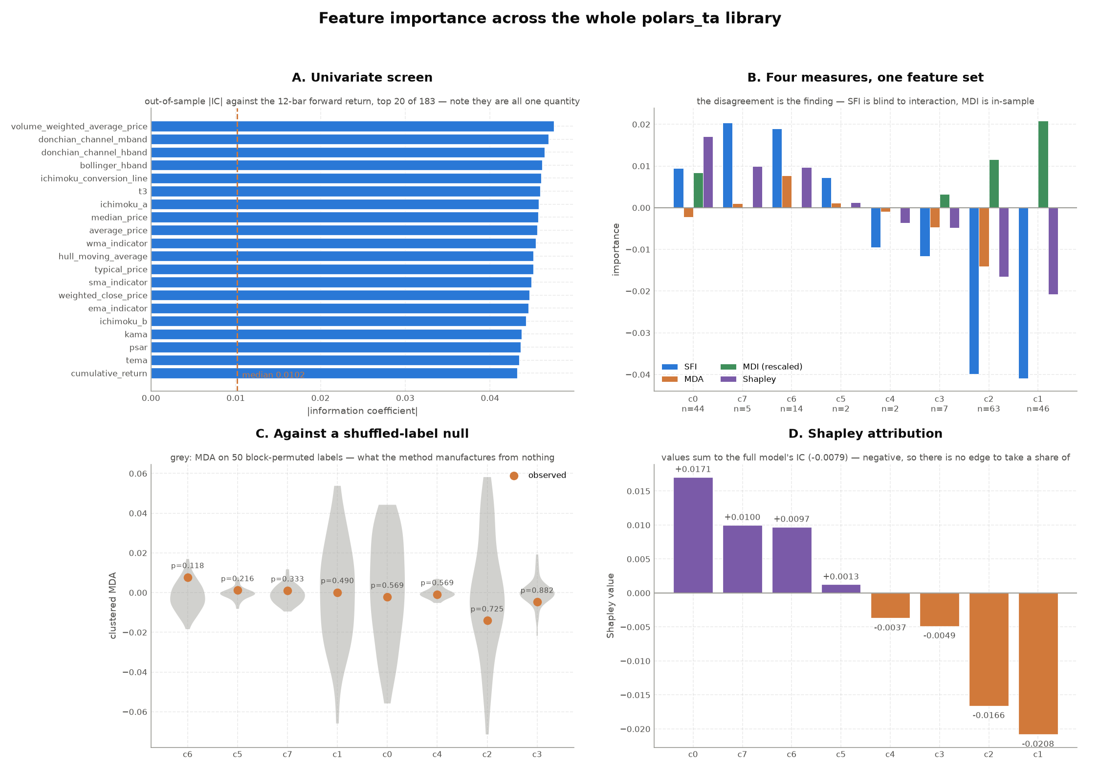
finishes the job — it takes the 183 screened indicators, cuts them into 8
clusters, and ranks them against a 12-bar forward return with every importance
measure the library exposes, then checks the whole ranking against a
shuffled-label null.
uv run python examples/plot_feature_importance.py
The answer: no
| Measure | Result |
|---|---|
| Best univariate |IC| | 0.047 (volume_weighted_average_price), t-stat 3.8 |
| Full-model out-of-sample IC | −0.0079 |
| Best cluster p-value vs the null | 0.118 |
| Clusters surviving Bonferroni at 5% | none |
The univariate screen looks promising — an \(|IC|\) of 0.047 with a t-stat near 4 would pass for a signal on many desks. It does not survive contact with a model, purged cross-validation, and a null. The full model's out-of-sample information coefficient is negative, and every cluster sits comfortably inside what the same pipeline produces on a scrambled label (panel C).
This is the correct result, and the point of the exercise. 200 technical indicators on 5,000 bars of one asset do not predict its 12-bar forward return. A pipeline that reported otherwise would be measuring its own leakage. Every guard in the module — purging, embargoing, block permutation, Bonferroni — is there to make this the outcome rather than a confident, wrong number.
What the disagreement between measures tells you
Reading four measures together is what makes the negative result interpretable rather than merely disappointing:
| Cluster | n | Example | SFI | MDA | MDI | Shapley | Reading |
|---|---|---|---|---|---|---|---|
| 0 | 44 | acc_dist_index |
0.0095 | −0.0022 | 0.191 | 0.0171 | Contributes only in combination — and only in some orderings |
| 6 | 14 | cdl_3_white_soldiers |
0.0190 | 0.0077 | 0.001 | 0.0097 | The most consistent of the eight, and still p = 0.118 |
| 2 | 63 | adx_pos |
−0.0399 | −0.0141 | 0.262 | −0.0166 | Actively harmful alone and jointly |
| 1 | 46 | adx |
−0.0409 | 0.0001 | 0.469 | −0.0208 | The forest's favourite; worthless out of sample |
Clusters 1 and 2 are 109 of the 183 features — the trend and momentum families. They score badly on SFI and near zero on MDA: nothing is lost by dropping them. Cluster 0 is the case that needs all three measures to read at all — top Shapley value, negative MDA. MDA alone would have called it harmful, SFI alone mediocre; Shapley says its contribution is real but order-dependent. The null then says none of it clears chance anyway.
MDI ranks it exactly backwards — the memorization signature
The RandomForestRegressor spends 47% of its total impurity reduction
on cluster 1, whose out-of-sample MDA is 0.0001 and whose Shapley value is
−0.021. Clusters 1 and 2 take 73% of the MDI budget between them and
contribute nothing out of sample.
The three candlestick clusters score 0.001 of MDI combined — despite
cluster 6 having the best MDA and the lowest p-value in the study. That is
MDI's cardinality bias in numbers: a continuous feature offers a tree
hundreds of split points, a 0/±100 pattern offers two, and MDI rewards the
opportunity rather than the content.
Read MDI alone and you would keep the 109 trend/momentum features and
discard the only cluster that came close to significance. This is precisely
why clustered_mdi
ships as a cross-check on MDA rather than a replacement for it.
Panel A is a redundancy finding, not a ranking
The top 20 features by \(|IC|\) are VWAP, Donchian bands, Bollinger bands, Ichimoku lines and six moving averages — all within 0.004 of each other, because they are all the same quantity: the price level. That is what a univariate screen looks like when you skip the redundancy pass first.
More indicator combinations
Trend + volatility regime filter
Combine ADX (trend strength) with Bollinger Band width (volatility) to flag "trending and volatile" periods:
from polars_ta import trend, volatility

out = df.with_columns(
    trend.adx("high", "low", "close").alias("adx"),
    volatility.bollinger_wband("close").alias("bb_width"),
).with_columns(
    ((pl.col("adx") > 25) & (pl.col("bb_width") > pl.col("bb_width").rolling_mean(20)))
    .alias("trending_and_volatile")
)
Volume-confirmed momentum
Require both RSI momentum and Money Flow Index (volume-weighted RSI-analogue) to agree:
from polars_ta import momentum, volume

out = df.with_columns(
    momentum.rsi("close").alias("rsi"),
    volume.money_flow_index("high", "low", "close", "volume").alias("mfi"),
).with_columns(
    ((pl.col("rsi") > 70) & (pl.col("mfi") > 80)).alias("overbought_confirmed")
)
Liquidity-aware execution gate
Combine Kyle's lambda (price impact) with VPIN (flow toxicity) to flag conditions where a large order is likely to move the market and get adversely selected — a real pre-trade check used by execution desks before sizing an order:
from polars_ta import microstructure as ms

out = df.with_columns(
    ms.kyle_lambda("close", "volume").alias("kyle_lambda"),
    ms.vpin("close", "volume", bucket_size=500, window=20).alias("vpin"),
).with_columns(
    (
        (pl.col("kyle_lambda") > pl.col("kyle_lambda").rolling_mean(200) * 1.5)
        & (pl.col("vpin") > 0.4)
    ).alias("thin_and_toxic")
)